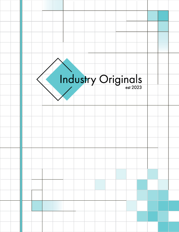
Industry Originals Logo
Objective
The primary objective of the logo design for Industry Originals is to establish a distinctive visual identity that resonates with the company's focus on supporting artists within the service industry.
Design Elements
Font Choice: The font is designed to evoke familiarity, appealing to a broad audience while maintaining a contemporary aesthetic.
Brand Mark: The logo includes two angled squares: The turquoise square to represent creativity and freshness, and the black outline which is slightly offset to enhance depth and direction, contributing to the logo's uniqueness.
Color Palette: The use of turquoise and black signifies a balance between modernity and professionalism.
Conclusion
The logo for Industry Originals effectively encapsulates the company's mission of promoting artists in the service industry through its thoughtful design elements. By combining familiar typography with innovative geometric shapes and a compelling color scheme, the logo serves as a strong visual representation of the brand's commitment to creativity and originality.


