Dropkick
Dropkick Presentation Panels
Objective
The primary objective of this collaboration was to design a series of panels for Dropkick Media Company that effectively articulate their business model. The panels aimed to enhance clarity and engagement during presentations, ensuring that the audience comprehends the key elements of the business.
Design Elements
Visual Simplicity: Each panel features straightforward imagery that and text that provides essential insights into the business model.
Brand Alignment: The design adhered to Dropkick's established brand guidelines, incorporating their chosen fonts and colors to maintain consistency.
Playful Yet Professional Theme: Inspired by the company logo, the design embodies a balance of playfulness and professionalism, reflecting the brand's identity.
Conclusion
The collaboration with Dropkick Media Company resulted in a cohesive set of presentation panels that not only align with their branding but also effectively communicate their business model. The design choices were intentional, aimed at enhancing audience understanding and engagement while remaining true to the company's playful yet professional ethos.
Dropkick Blueprint Iconography
Objective
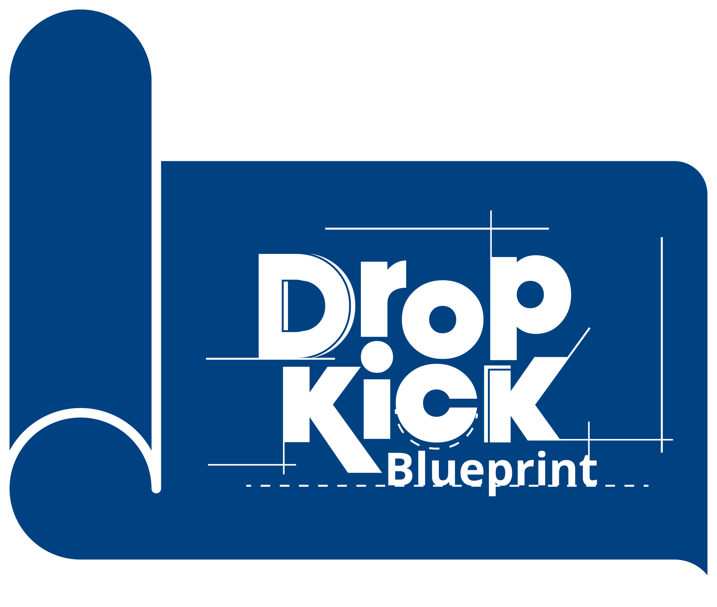
The primary objective of this project was to collaborate with Dropkick, a media company, to create an icon that enhances the clarity and efficiency of their internal processes. This icon serves as a visual representation of the 'blueprint' phase of their business model, clearly outlining the tasks and creative directions for each client.
Design Elements
Icon Concept: The design features a classic representation of a blueprint, symbolizing the foundational planning stage of project development.
Integration of Branding: The icon incorporates the main Dropkick company logo, ensuring brand consistency and recognition.
Visual Features:
Dashed and Solid Lines: These elements mimic the design of traditional blueprints, enhancing the icon's relevance and context.
Developmental Stage Representation: The use of lines suggests an ongoing process, effectively conveying the team's current position within their project workflow.
Conclusion
The icon designed for Dropkick successfully fulfills its intended purpose of streamlining internal processes by visually representing the 'blueprint' phase of their projects. Its design not only integrates essential branding elements but also reinforces the developmental aspect of their workflow, aiding in the simplification and communication of project stages to the team and stakeholders.
A word from Kyle Davidson | CEO, Dropkick
Working with Trevor has been a game-changer for our business. We’ve worked with a lot of graphic designers in the past, and the quality of Trevor’s work and the experience he provides is on another level. Every design he delivers is high quality with fast turnaround times, even on short notice. We wouldn’t hesitate to utilize his services again!


